Hydro One:
%201.png)
Design and Communications Internship
All content displayed has been approved for use in my portfolio by the Enterprise Architecture Governance Team
Duration:
4 months
Team:
Amie Ahn
Role:
Marketing Operations
Graphic Designer
Content Designer
UI/UX Designer
Tools:
Figma
Microsoft Office
Adobe Photoshop
Adobe Illustrator
Overview
During my internship at Hydro One, Ontario’s largest electricity transmission and distribution provider, I worked as a Design and Communications Intern within the Business Solutions division, supporting the Enterprise Architecture Governance Team.
My role extended beyond visual design into marketing operations and digital content management. I developed and maintained branded templates, presentation frameworks, infographics, and communication assets that improved consistency, efficiency, and alignment with corporate brand standards across the team.
I also led the redesign of the team’s internal site, restructuring its information architecture, refining navigation, and implementing a cleaner visual system. By introducing structured content practices, I improved content discoverability and supported long term governance, strengthening internal communications across the team.
User Pain Points
1. Outdated graphics
2. Site is not searchable
3. Confusing format and layout
4. Imagery provides no relevance
5. Inconsistency
Stakeholder Requirements
1. Make content searchable
2. Easy to edit and modify
3. Keep it simple
4. Align with Hydro One guidelines
5. Functional

.png)

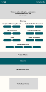
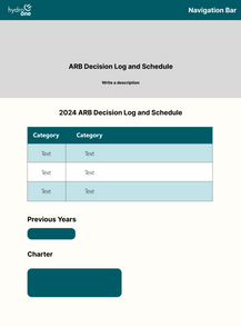
Wireframes
Main Changes
-
Applied New Brand Guidelines: Ensured visual and structural consistency across all design elements.
-
Refined Visual Assets: Reworked 68+ images and diagrams to align with updated branding.
-
Improved Accessibility: Enabled searchable text and tables to enhance usability.
-
Restructured Content: Organized site information for a more intuitive and user-friendly flow.
-
Standardized Naming: Renamed pages, titles, and headers for greater clarity and coherence.
-
Updated Visuals: Refreshed icons and images to better support content and user experience.
-
Modernized Layout: Optimized formatting and structure for readability and engagement.
-
Introduced Top Navigation Bar: Added fixed navigation for faster access to key sections.
Before and After

.png)


Reflection & Learnings
Designing at scale
Balanced creativity with structured design systems and governance frameworks within a large organization.
Marketing operations and content governance
Developed standardized templates and content systems that improved consistency, efficiency, and long term scalability.
Cross functional collaboration
Partnered with technical and business stakeholders to align content strategy with operational and communication goals.
User centered optimization
Applied UX principles to strengthen information architecture, navigation, and overall content experience.


